

Here at VCTI we’re used to change. Our customers’ needs are constantly evolving, we’re constantly adding exciting new capabilities, and our employees never stop finding new ways to help our customers provide internet access and cloud services to everyone, everywhere. Around here, change is good. Today marks an exciting day at VCTI.

We are launching our new brand identity – a new logo and a bold color scheme. Our logo has been updated with a modern look to reflect who we are today and to symbolize our dynamic future.
As we set out to redesign our creative, it was important that we match our visual identity with our overarching mission. Conveying this link between identity and promise is the foundation for any successful brand.
Here are a few of the key ideas that we want our brand to convey.
-
-
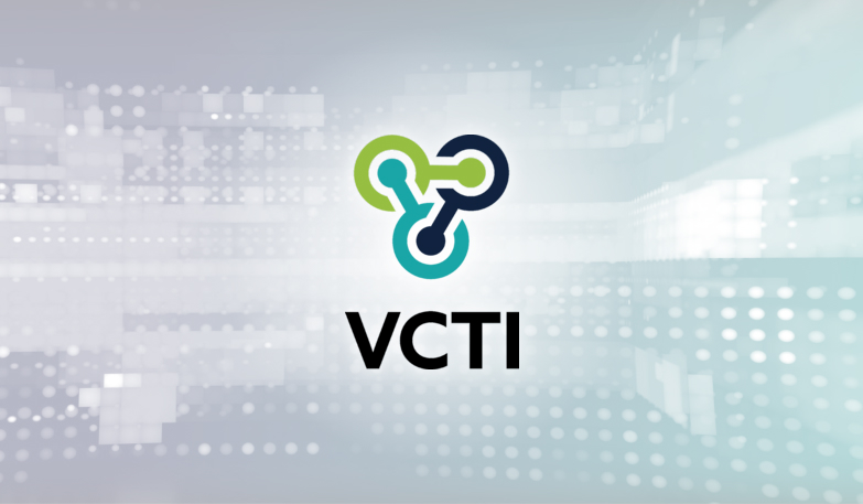
- The logo represents the relationship between three entities::
- VCTI’s three lines of business – broadband expansion, digital transformation of network operations, and secure delivery of cloud services.
- The tight interconnection needed between our employees, leadership, and customers to deliver customer-centric products and services.
- The mark is a modern take on a classic network icon and illustrates our core expertise – networking.
- The mark is also an interpretation of the infinity icon (∞) and suggests infinite opportunity for growth – for our company, our customers and our employees.
- The sans-serif font is modern and was selected to show our strength and resiliency
- The logo represents the relationship between three entities::
-
Although we are transitioning to a new look, our mission hasn’t changed!
We continue to accelerate the way companies provide fast and secure internet access and cloud services to everyone, everywhere.